

My text editor doesn’t spoil many secrets, its title bar simply glows “stop_times.txt – nycsubway”. Below that, lines of gibberish seem to cascade downward endlessly, patterns coyly exposing themselves in streaks of data as I scroll down violently. In one file hides every single stop, made by every single train, running along every single route of the MTA New York City Subway. There are a few other files in the folder that can help describe some nuances, but stop_times.txt reigns supreme in its overwhelming size. One text file that *is* the entire Subway. At last count, it’s 522,670 lines long. I could spend my entire summer just scrolling that far, surely rubbing the pads of my fingers down to the bone in the process, but my plans are slightly more ambitious, slightly less crazy.
I’m hardly the first person to expand one of these transit information feed archives and watch in awe as nearly 40 million characters of text unravel into neat rows of bits on my hard drive. Pick any mobile platform and any transit system you ‘like’ (read: live near), and you’ll find plenty of apps out there that give you schedule information; you might be convinced smartphones are good for nothing else. All of them get their know-how from this GTFS data, published by just about every transit authority worldwide. The universal format was first developed by Google when they wanted to add transit information to Google Maps, so you might guess what the acronym stood for initially, but big-search donated the standard to the world, and now it’s simply “General Transit Feed Specification”. I can’t thank them enough, because without GTFS, our transit applications would still be in the stone ages, the era where transit bureaucracies seem to be stuck with their paper schedules and punched tickets.
I click over to a terminal window, where a Python script sits waiting to be executed. One keystroke, and ./nycsubway/*.txt becomes hundreds of thousands of objects with millions of connections. Routes get trips, trips get stops and times, object pointers are flying like bullets in a wild west shootout, and somewhere deep inside my computer, a memory management unit is contemplating an easier way out of it all. That’s what it takes to make GTFS data into something that makes human sense, unless you have a natural knack for trip_ids like A20120610WKD_013300_1..N03R. That’s a Bronx-bound 1 train running on a weekday departing South Ferry station at 1:30pm. I can tell you all that offhandedly because I was raised by computers, and I sadly speak their language. What about everyone else?
Even with this small library’s worth of data, it’s the exceedingly simple answers that are hard to come by. Where’s the file that tells me that the 6 train stops at Spring Street every 4 minutes? Most end users come wondering these very things, and yet it’s not exactly written on the wall for us. The developer is tasked with reading between the lines — all 522,670 of them. I’m hardly complaining, GTFS does exactly what it needs to do, which is perfectly describe every single movement in bleeding detail. The issue is in us, the developers who regurgitate these numbers as the only reality with little translation done in the process. Computers speak in cold hard literals, but humans see with warm fuzzy inferences. There’s a gap, one that calls for a bridge.
TRANSient
I’m introducing a project that’s trying to build that bridge, because I think that commuting can be simplified a bit more. We’ve come a long way with our current set of solutions, but there’s still some friction between how people see trains (basically a map, routes stop at X,Y,Z stops) and how they’re told about them (A departs from Y at 6:07pm).
TRANSient Beta is the first peek at this idea, an app that attempts to boil the New York City Subway down to simplicity. Most of us commuters have been around, and we know some trains run express during rush hour, some don’t run at night, and others are cut short over the weekend. Open TRANSient, and you’re immediately presented with a subway map that’s correct for the current date and time, 24/7/365.

But it gets even better, service advisories are another hassle we can simplify. Most often during the weekends, construction projects send trains along tracks far, far away. The MTA posts advisories to inform the populace in transit, but those of us without a Ph.D in cryptology are left guessing. These are fed into TRANSient too, and the map is adjusted to show where those trains go when they scatter on a seemingly daily basis.
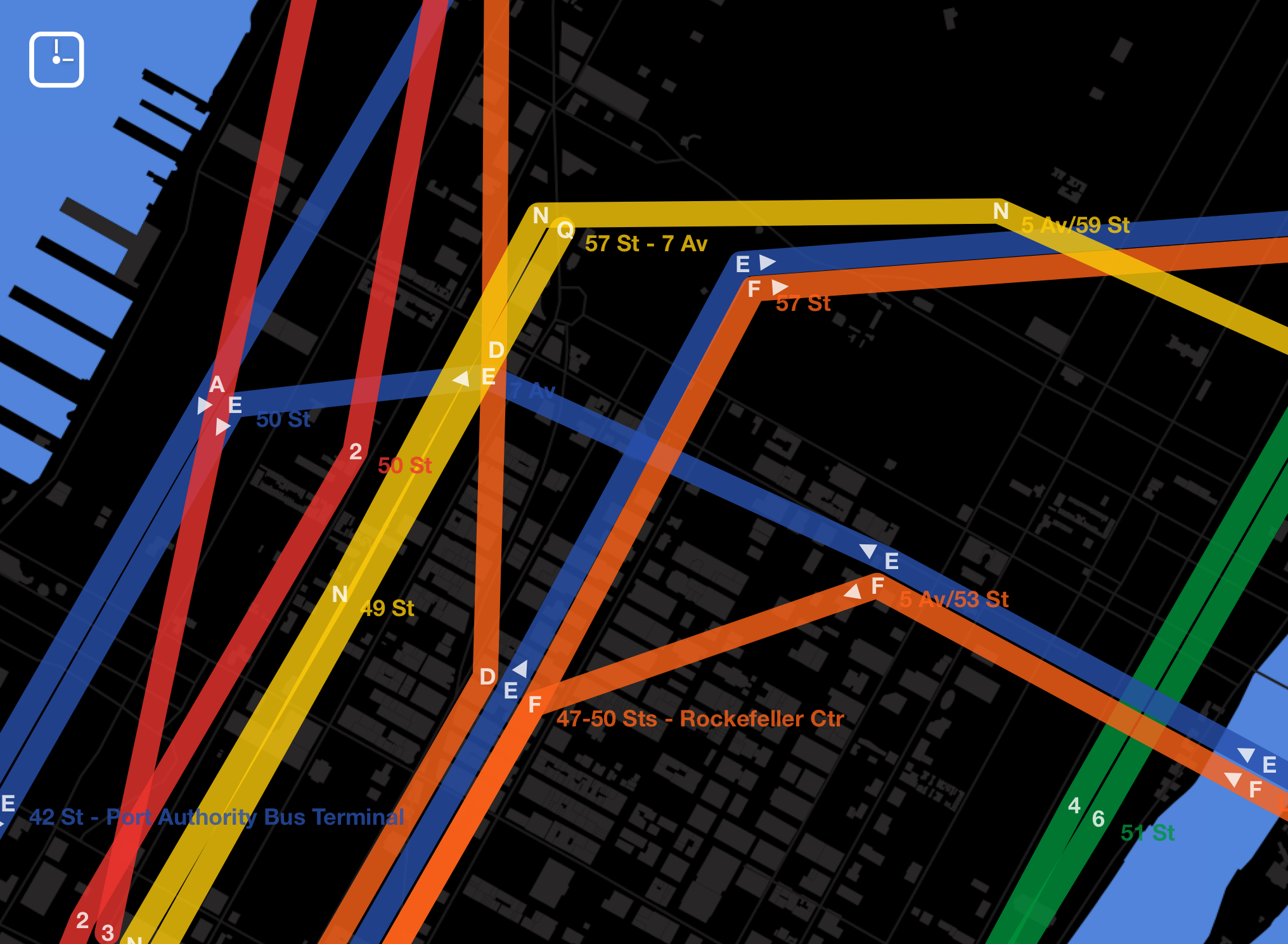
So the end result is a map that’s a vast departure from what we might usually think of as a subway map. Instead of using verbose labels or different symbols to show changes in service, it’s simply correct for the one time you care about: now.
Now, TRANSient is not yet a transit app, per se; it’s a demo of a concept that will soon mature into a complete solution. What it does provide is unique: a human-parseable overview of subway service. What it doesn’t provide is also unique: train schedules. It’s quite surreal what can end up on the cutting room floor when time is of the essence. When even MVP seems like a grand scheme, minimum executable product becomes a thing.
But room to grow has never hurt anyone.
–Rob
