
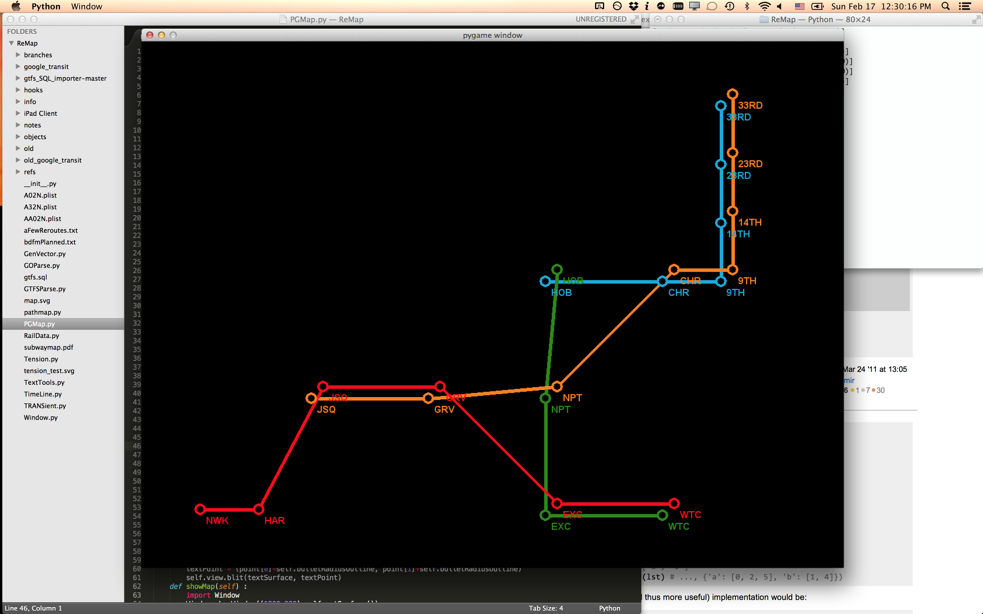
Aesthetic Design Algorithm for Public Transit Information Diagrams, ADAPTiD for short. As of yet, it’s just a dinky line simplifier that has been fed data from NYC’s PATH rail system, which connects Manhattan with points west across the Hudson. Yes, giving such a project an acronym already is perhaps akin to publishing my work on “Hello World”. This is true, but there’s no one out there to deny my request to acronym-ize myself so soon; perhaps I’ve abused this liberty.
So why does the world need a program that can automatically generate subway maps? Well if you’re anything like me and you live in a city, public transit is how you get around. You refuel not at a gas pump but at a MetroCard machine. You laugh as drivers kill each other over parking spots.
But then there are those times you’re left standing on a train platform — you’re waiting for a train that you must eventually admit will never come. Transit maps are designed to be accurate at one time: rush hour on a weekday. Every other second (which is a lot of seconds), you need to know what the exceptions are and what they mean. And when you start considering planned and unplanned service disruptions, that map might never be accurate. So keep on waiting, that train’s not coming, not today.
But what if you could design a subway map that’s always right? It would look at the day and time and show you only the service that’s running. If you’re lucky, it would even check for reroutes and suspensions, and adjust itself accordingly. I think we have the technology.
